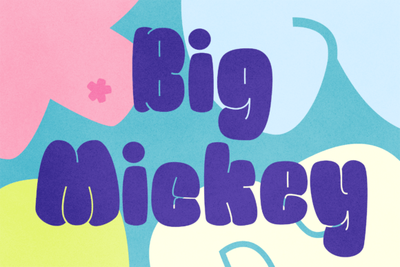
Big Mickey: A Playful Display Font for Web Design
Big Mickey in a Hero Section for a Children’s Bookstore
I was working on a redesign for a boutique online store selling children's books when I first tested Big Mickey. The client wanted something playful yet professional, and Big Mickey immediately stood out with its bold and chunky design. Its rounded corners and chubby shapes gave the hero section a friendly, approachable feel that matched the brand’s tone perfectly.
I used Big Mickey for the main headline over an image of a cartoon book cover. It added weight to the title without overwhelming the visual layout. The font's display characteristics made it ideal for grabbing attention while maintaining readability on both desktop and mobile screens.
Big Mickey for Product Titles on an Online Store
Next, I experimented with using Big Mickey for product titles across the online store. Since the store sells cartoon-themed books, the font naturally complemented the branding. Each product title felt like part of the story, which helped create a cohesive visual identity.
I noticed that Big Mickey worked best for short phrases. Longer text would have looked cluttered, so I paired it with a clean sans-serif font for body copy. This font pairing ensured that the content remained easy to read while keeping the overall look fun and engaging.
Big Mickey in a Call-to-Action Button on a Landing Page
I tried using Big Mickey for a call-to-action button on the landing page. At first, it seemed too playful for a CTA, but after adjusting the size and contrast, it worked surprisingly well. The boldness of the font encouraged clicks, making the action feel more urgent and exciting.
However, I made sure not to use Big Mickey for longer buttons or complex messaging. It’s better suited for short, punchy phrases that need to stand out. This aligns with the font’s Display purpose—making key messages pop without distracting from the rest of the page.
Big Mickey for a Blog Header with a Digital Brand Kit
When designing a blog header as part of a digital brand kit, I used Big Mickey for the blog title. It brought a sense of humor and creativity to the header, which aligned with the brand’s personality. I paired it with a minimalist sans-serif font for the subtitle to maintain balance and readability.
The font’s chunky style made the title visually dominant, which helped users quickly identify the blog’s focus. I also considered how it would render on different screen sizes, ensuring that it remained legible even on smaller devices.
Big Mickey for a Course Sales Page with a Creative Portfolio
In another project, I used Big Mickey for a course sales page belonging to a creative portfolio site. The goal was to make the course title stand out against a colorful background. The font’s bold and rounded features created a friendly, inviting atmosphere that resonated with the target audience.
I made sure to test the font on dark and light backgrounds to ensure it remained readable. While Big Mickey performed well on most backgrounds, I avoided using it on very busy or patterned designs where it might get lost.
Big Mickey for a Campaign Landing Page with a Coaching Website
On a coaching website’s campaign landing page, I applied Big Mickey to the headline to emphasize the message. The font’s chubby shapes gave the page a warm and welcoming vibe, which was perfect for attracting new clients.
I used Big Mickey sparingly, only for the main headline and a few key sections. This kept the design from feeling too busy and maintained a clear visual hierarchy. The font’s Display nature made it ideal for creating impact without sacrificing usability.
Big Mickey for a Promotional Banner on a Small Business Website
For a small business website promoting a summer sale, I used Big Mickey in a promotional banner. The font’s bold and funny characteristics fit the theme of the promotion perfectly. It helped draw attention to the offer and made the banner more memorable.
I also checked the file formats and webfont availability to ensure that Big Mickey loaded quickly and rendered correctly across all devices. This is essential for maintaining good performance and user experience on any website.